Have you ever looked at a product online and immediately lost interest because of the photo?
Maybe it was blurry. Maybe the lighting was terrible. Maybe the angle hid the one thing you actually wanted to see.
So you closed the tab and kept scrolling.
That’s what your product photos are up against.
Part of my job at Order Desk is sharing our customers’ stories on social media. That means I spend a lot of time browsing their stores and seeing how they feature their products.
The best photos tend to answer three simple questions:
What am I buying? What makes it worth the price? What will it look like in real life?
You can answer all three with a phone, some natural light and a little planning.
Here are three Order Desk customers who nailed their product photos—and a few ideas you can steal for your own store.
1. Keep the main photo simple
Look at SnackMagic’s product photos.
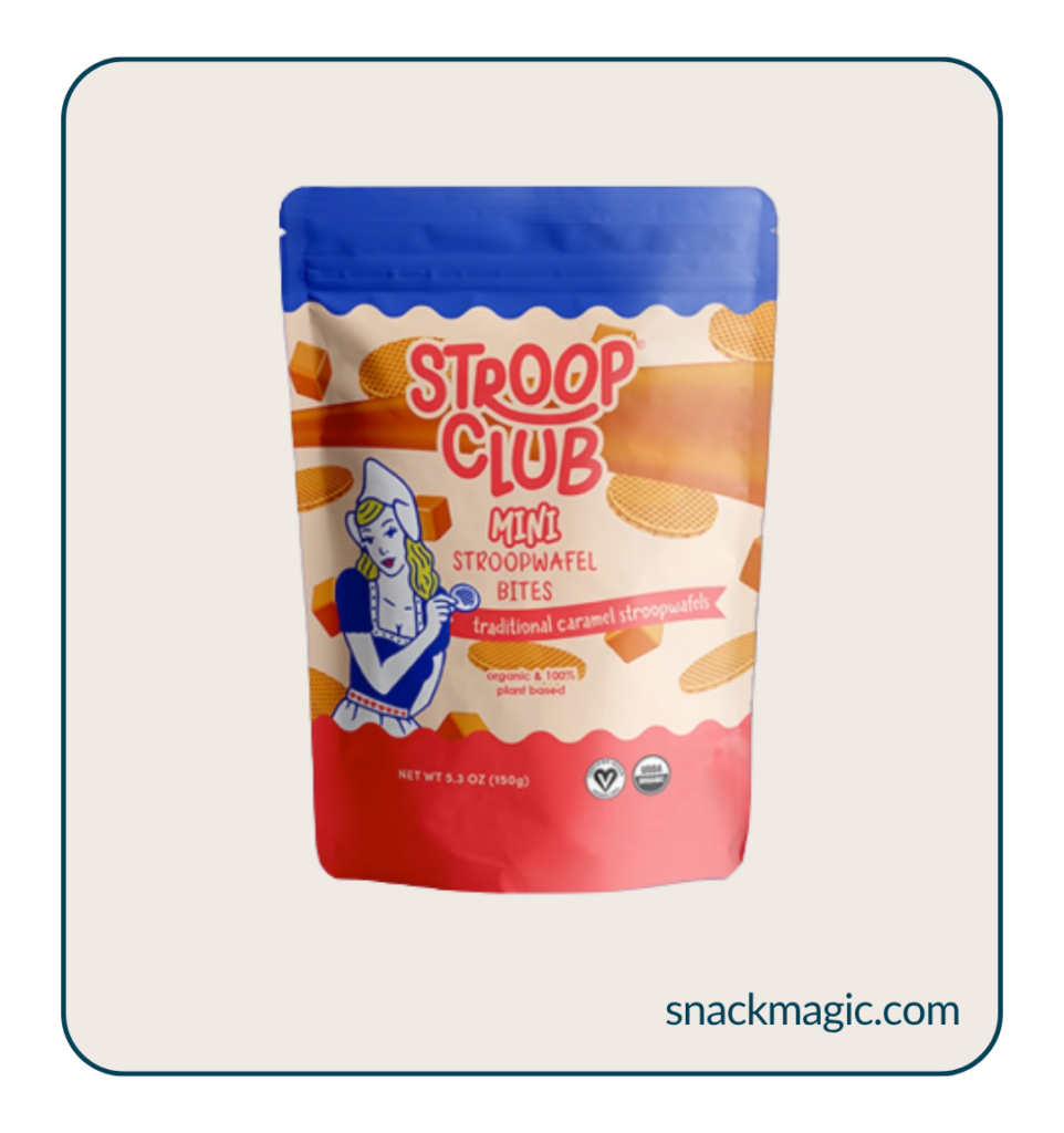
It’s literally just the product on a plain background. Nothing fancy. Nothing distracting. You know what they’re selling immediately.
This is really helpful when you’ve got the same product in a bunch of different flavors, colors or sizes. People can swipe through the options and spot the differences without trying to figure out what they’re looking at.
You can recreate this at home with a plain wall, some poster board or a table near a window. Take one product at a time, make it nice and big in the frame, and keep the lighting and angles fairly similar.
And your background doesn’t have to be boring. Add some color or texture if it feels like your brand. Just don’t let it upstage the thing you’re trying to sell.
2. Show the details people could miss
Your main photo shows people what you’re selling. The close-ups show them why it’s worth buying.
Crackerjack Shack zooms right in on the good stuff: the texture, stitching, print quality and all those tiny details you’d completely miss in a thumbnail.
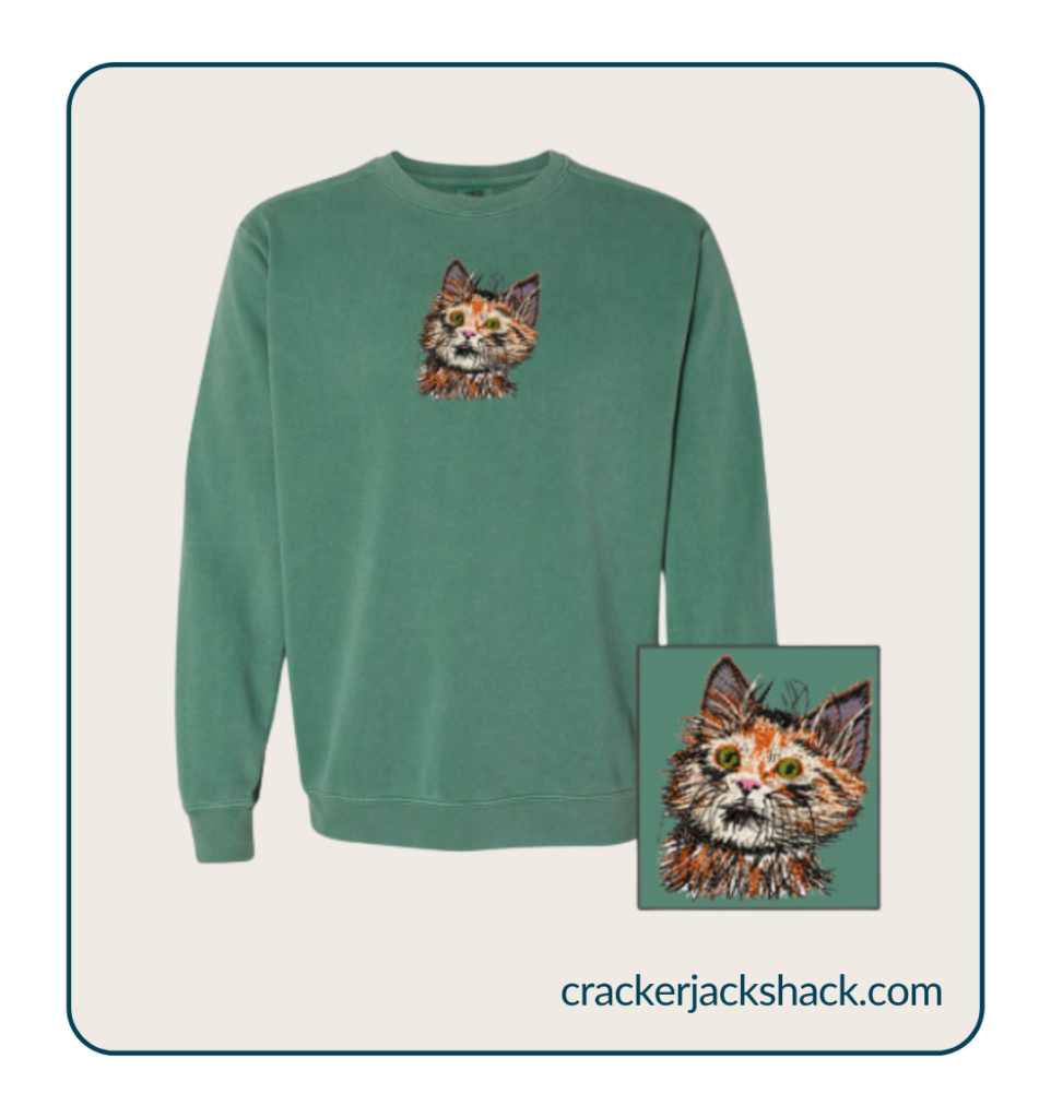
Photos have a habit of flattening everything. Embroidery can look printed, textured fabric can look smooth and anything handmade can disappear completely.
So get in close and show:
- The texture of the material
- Stitching, printing, engraving or embroidery
- Buttons, pockets and zips
- The inside and back
- Anything you’ve finished by hand
These photos also help people understand the price. If you’ve used better materials or spent hours getting the details right, let people see it.
You did the work. Don’t make shoppers squint to find it.
3. Put the product in real life
Rupt is really good at showing its products out in the world.
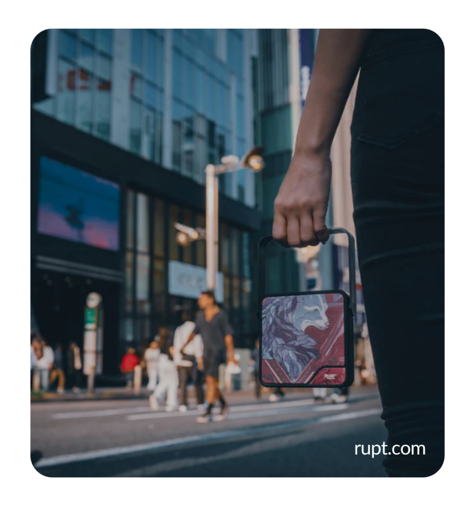
You can see how big the product is, what it looks like in someone’s hand and whether it would actually fit into your life. Because it’s much easier to want something when you can already picture yourself using it.
Even a water bottle starts to feel like part of your morning walk, your gym routine or your latest attempt to remember that coffee is not hydration.
Try photographing your product:
- Being worn, held or used
- Somewhere people would actually use it
- Next to familiar objects so its size is clear
- In a few everyday situations
Keep it real. Put the notebook on a desk. Take the picnic blanket outside. Photograph the mug somewhere people actually drink coffee.
You don’t need twelve lemons and a vase mysteriously balancing in the background. Nobody’s kitchen looks like that.
Bring all three together
Think of your product photos as a tiny sales team. Each one has a job:
✅ A clear product photo shows them exactly what they’re buying.
✅ A close-up shows them the details that make it worth buying.
✅ A real-life photo helps them imagine it in their own life.
One shows them what they’re buying. One proves the quality. One helps them picture it in their own life.
Put them together and you’ve answered the practical questions while giving people a reason to get excited.
Look at your photos like a customer
Forget everything you know about the product for a second and pretend you’ve just found it online.
Would you know what size it is? Can you see the features that matter? Are the colors accurate? Does it still look good on a phone?
Most importantly, is every photo telling you something new?
Three useful photos will beat seven nearly identical angles every time. Nobody needs to see the same mug turned two centimetres to the left.
A little editing can help your photos look brighter and closer to how the product looks in real life. Just be careful with heavy filters or color changes. If the blue shirt in the photo arrives looking green, your customer probably won’t be thrilled. Keep it accurate and save yourself the returns and bad reviews.
Start with one product
Please don’t spend your entire weekend reshooting your store. By Sunday night, you’ll be tired, surrounded by props and mildly annoyed that you ever decided to sell anything.
Pick one bestseller and take three photos: one clear shot, one close-up and one showing it in real life.
Add them to the product page, reuse them on social media, then move on to the next product when you’re ready.
That’s it. Start small. Show people what they’re buying, what makes it worth the money and how it fits into their life.
_____________________________________________________________________________________________________________________________________
Taken some product photos you’re proud of? Share them in the Order Desk community! We’d love to see what you’re selling and you might give another store owner a few ideas too.